After creating sales templates, documents, and sequences, you can analyze their effectiveness using the sales content analytics tool. During the analysis, you can export your data or save the chart as a report. Otherwise, learn how to add a report from the report library to your dashboard.
Analyze your templates
You can analyze the templates sent by your users.
- In your HubSpot account, navigate to Reports > Analytics Tools.
- Click Sales Content Analytics.
- Use the Date range and Frequency dropdown menus to filter the data to a specific time range.
- This will filter the data in any tab you're in.
- A week in the report starts on Sunday by default, when the date range selected consists of a week, or when the frequency is set to Weekly.
- By default, the data in the chart will be categorized by template.
- If By template is selected, click the Folder dropdown menu to filter the data to a specific folder.
- To view your data by user, click By user.
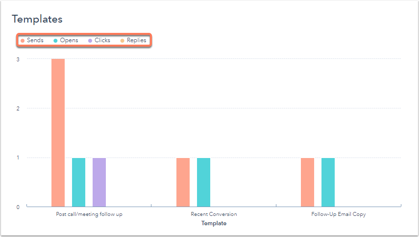
Templates chart
The chart represents the data visually, organized by template or user.
- Hover over areas in the chart for more data.
- Click to select or clear metrics, such as Sends, Opens, Clicks, or Replies, to include or exclude them from the chart.
- In the table below, select the checkbox next to a template to include it in the chart. Select multiple UTM parameters to compare their impact.
Templates table
The table shows the data by template or user.
- To customize the metrics that appear in the table:
- In the upper right, click Edit columns.
- In the dialog box, select the checkbox for each metric you want to display.
- Click the X next to a property in the Selected columns section to remove it from the table.
- Click Save to apply these changes.
- Click a column header to sort the templates by that metric.
- To view a specific template, click the template name if the data is displayed by template. If the data is displayed by user, click the user to view the templates they've sent, then click the template you want to view.

Analyze your documents
You can analyze the documents shared by your users.
- In your HubSpot account, navigate to Reports > Analytics Tools.
- Click Sales Content Analytics.
- Use the Date range and Frequency dropdown menus to filter the data to a specific time range.
- This will filter the data in any tab you're in.
- A week in the report starts on Sunday by default, when the date range selected consists of a week, or when the frequency is set to Weekly.
- Click the Documents tab.
- To filter the document data to a specific user, click the User dropdown menu and select the user.
- View a high level overview of the document metrics.
- In the table below, you can do the following:
- To customize the metrics that appear in the table:
- In the upper right, click Edit columns.
- In the dialog box, select the checkbox for each metric you want to display.
- Click the X next to a property in the Selected columns section to remove it from the table.
- Click Save to apply these changes.
- Click a column header to sort the documents by that metric.
- To view a specific document, click the document name.
- To customize the metrics that appear in the table:
Analyze your sequences
- In your HubSpot account, navigate to Reports > Analytics Tools.
- Click Sales Content Analytics.
- Use the Date range and Frequency dropdown menus to filter the data to a specific time range.
- This will filter the data in any tab you're in.
- A week in the report starts on Sunday by default, when the date range selected consists of a week, or when the frequency is set to Weekly.
- Click the Sequences tab.
- To filter the sequence data to a specific folder of sequences, click the Folder dropdown menu and select the folder.
- View a high level overview of the sequence metrics.
- In the table below, you can do the following:
- To customize the metrics that appear in the table:
- In the upper right, click Edit columns.
- In the dialog box, select the checkbox for each metric you want to display. You can only display up to seven metrics in the table. The metrics are:
- Sends: total number of emails that were sent during a sequence.
- Opens: total number of emails that were opened during a sequence.
- Opens per enroll: percent of enrolled contacts who opened any email in the sequence.
- Clicks: total number of clicks on sequence emails.
- Clicks per enroll: percent of enrolled contacts who clicked a link in an email sent from the sequence.
- Enrolls: total number of contacts enrolled in a sequence.
- Replies per enroll: percent of enrolled contacts who replied at least once to any email sent from the sequence.
- Meetings booked: total number of meetings booked from a link included in an email sent from during the sequence.
- Meetings booked per enroll: percent of enrolled contacts who booked a meeting while enrolled in the sequence.
- Unenrolls: total number of contacts who unenrolled from the sequence.
- Unenrolls per enroll: percent of enrolled contacts who were unenrolled from the sequence, either manually or automatically.
- Failures: total number of contacts who did not successfully enroll in the sequence because of an error, not including bounces or unsubscribes.
- Failures per enroll: percent of enrolled contacts who did not successfully enroll in the sequence.
- Executing: total number of contacts still active in a sequence.
- Replies: total number of replies to emails sent during a sequence.
- Completions: total number of contacts who were sent the last email in a sequence without being unenrolled.
- Completions per enroll: percent of enrolled contacts who were sent the last email in the sequence without being unenrolled.
- Manuals: total number of contacts who were manually unenrolled from a sequence.
- Click the X next to a property in the Selected columns section to remove it from the table.
- Click Save to apply these changes.
- Click a column header to sort the sequences by that metric.
- To view a specific sequence, click the sequence name.
- To customize the metrics that appear in the table:
Export or save the data as a report
In each tab, you can export the data:
- On the right, click Export to export the data.
- In the dialog box, enter the Name of your file and click the File format dropdown menu to select a format. Click Export.
- The export file will be sent to your email address and can be downloaded in your notification center, accessed by clicking the notification icon in the top right.
You can also save the chart as a report in your reports list:
- On the right, click Save as report.
- In the dialog box, enter the Report name.
- To add the report to a dashboard, click the Add to dashboard dropdown menu and select if you want to add it to an existing dashboard or create a new custom dashboard.
- If you select Existing dashboard, click the Select existing dashboard dropdown menu and select the dashboard to add the report to.
- If you select New custom dashboard, enter the Custom dashboard name and click the Visibility dropdown menu to select if the dashboard should be shared, shared but read only to others, or private to your own user.
- Click Save & add.