In the service team productivity report, you can report on your service team's performance across tickets. You can also export the data or save the data as a report.
If you're looking to analyze your sales team's productivity, check out this article instead.
- In your HubSpot account, navigate to Reports > Analytics Tools.
- Select Service Team Productivity.
- Use the Date range and Frequency dropdown menus to filter the data to a specific time range. A week in the report starts on Sunday by default, when the date range selected consists of a week, or when the frequency is set to Weekly.

- By default, Owner will be selected and your service team productivity data will be segmented by your HubSpot users.
- If Owner is selected, you can click the Team dropdown menu and select a team to filter the data to.
- To view your data based on the HubSpot team, select Team.
- Click the Pipeline dropdown menu to select the pipeline to filter to the data to.

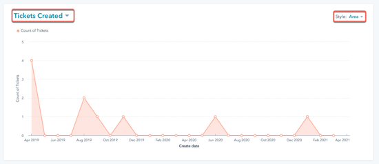
Chart
- In the upper left of the chart, click the dropdown menu and select a metric:
- Tickets closed
- Average time to first agent reply
- Average time to close
- In the upper right of the chart, click the Style dropdown menu and select the type of chart you want to use for analysis. You can select an area chart, column, line, or a combination of an area and line chart to visualize the data.
Table
The table shows you the data per team or owner, for each metric.
- Click a column header to sort the owners or teams by that metric.
- In the Count of tickets column, click a value to view the related tickets in the right panel.
- Click the ticket name to access the tickets record.
- Click Go to Tickets in the right panel to view all the tickets in a saved filter.
- To view only certain owner's or team's tasks in the chart, select the checkbox next to the owner or team. You can select multiple owners or teams to compare their impact.

Export or save the data as a report
In each tab, you can export the data:
- On the right, click Export to export the data.
- In the dialog box, enter the Name of your file and click the File format dropdown menu to select a format. Click Export.
- The export file will be sent to your email address and can be downloaded in your notification center, accessed by clicking the notification icon in the top right.
You can also save the chart as a report in your reports list:
- On the right, click Save as report.
- In the dialog box, enter the Report name.
- To add the report to a dashboard, click the Add to dashboard dropdown menu and select if you want to add it to an existing dashboard or create a new custom dashboard.
- If you select Existing dashboard, click the Select existing dashboard dropdown menu and select the dashboard to add the report to.
- If you select New custom dashboard, enter the Custom dashboard name and click the Visibility dropdown menu to select if the dashboard should be shared, shared but read only to others, or private to your own user.
- Click Save & add.