In the reports tool, you can view all of the standard reports in your account, along with any custom reports that you create. With custom reports, you can analyze records and activities in your HubSpot account in a few different ways:
Learn more about different types of reports you can create and how you can manage your existing reports.
Please note: Professional accounts can have up to 20 custom reports; Enterprise accounts can have up to 500; and Reporting add-on accounts can have up to 2,000. For Enterprise and Reporting add-on accounts, there is a limit of 200 cross-object reports.
Single data set or across data sets
With single data set reports, you can report on one record type: contacts, companies, deals, tickets, activities, or products. With reports across data sets, you can analyze relationships between two different record types.
- In your HubSpot account, navigate to Reports > Reports.
- Click Create custom report.
- In the left panel, select Single object or Cross-object.
- Select the objects you want to report on, then click Next.
- At the top, click your report's name to edit it.
- In the left panel, click Add [Object type] Property to browse and select the properties you want to report on.
- After selecting these properties, in the left panel, drag and drop properties to reorder the columns in the table on the right.
- To remove a property, click the x.
- In the upper left, click Filters to segment the records that appear in your report.
- Click Add filter and browse or search for the property you want to use to filter your report, then set the criteria.
- If you are reporting on deal amounts and have multiple currencies, you can add the Currency property here to filter deals with a specific currency.
Please note: you must add at least one filter to your report.
- After setting up your properties and filters, click Get data to run your report.
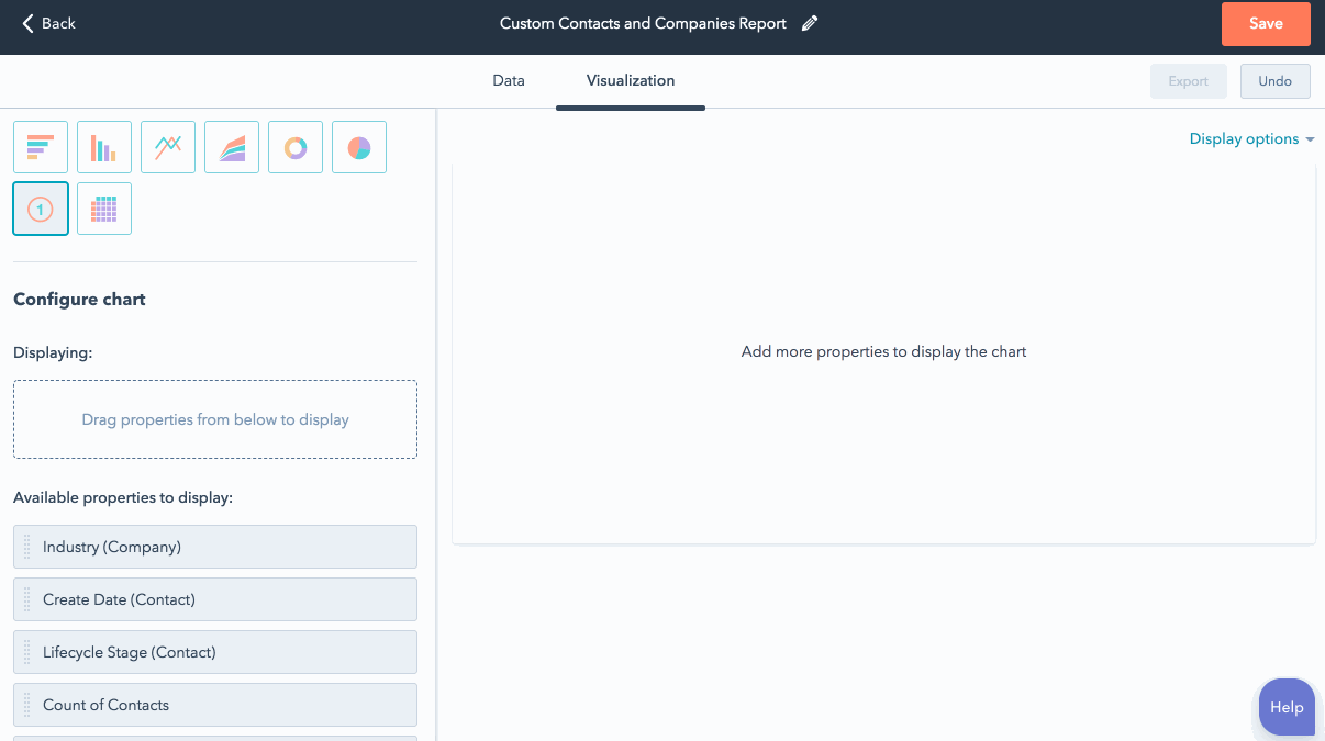
- Click the Visualization tab to customize the chart for your report.
- Select a chart type. The options depends on the object type you've selected and may include Bar, Column, Line, Area, Doughnut, Pie, Summary, and/or Table.
- In the Configure chart section, drag and drop properties to the Displaying section to add them to your chart. You must select a date property or a property that gives a specific count to plot your data.
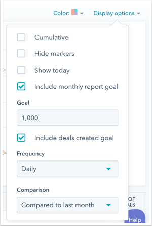
- If you've selected a line or area chart with a date property as a report measure, you can compare the current data set with a goal or a previous time period. In the upper right, click the Display options dropdown menu.
- To compare your data with a static number goal for each month, select Include monthly report goal and enter the monthly goal in the Goal field.
- To compare your data with existing goals you've set related to the data in your report, select Include [measurement] goal
- To compare your data with a previous time period, click the Comparison dropdown menu and select the date range you'd like to compare the current data to. The options displayed here depend on date property filters you've set.
- If you are reporting on deals, have multiple currencies in your account, and have chosen to display the Amount in company currency property, the Closed amount in company currency property, or the Forecast amount in company currency property, amounts will be displayed in the company currency by default. Click the Currency dropdown menu to convert amounts to another one of your currencies.
- To receive a file with your report's data, click Export in the upper right. In the dialog box, select the File type, enter the Email address to receive this file and then click Export.
- When you're done with your report, click Save to add it to your list of saved reports.
Funnels
Contacts or deals funnel
With a contacts or deals funnel report, you can see how contacts or deals are moving through lifecycle or deal stages over time.
To create a contacts or deals funnel report:
- In your HubSpot account, navigate to Reports > Reports.
- Click Create custom report.
- In the left panel, select Funnels. Select Contacts or Deals, then click Next.
- At the top, click the pencil icon edit to edit the report's name.
- In the upper left, click Filters to select properties to compare across your records, and specify the date range for your report. Your report will only include contacts or deals with a create date within the specified date range.
- Click the Visualization tab to customize the chart for your report:
- Select a chart type: Funnel bar, Column, or Table.
- Under Configure funnel, click the Add stage dropdown menu to select stages to include in your report. Drag and drop stages to reorder them. To remove a stage, click the x to the right.
- Click the all dropdown menu to select one of the two types of funnel reports:
- All: report on contacts or deals that have ever moved through all the stages you've selected within the specified date range. Select this option if you want to include conversion rates between each stage.
- Any: report on contacts or deals that have ever gone through any of the stages you've selected within the specified date range.

- Click Run report.
- To receive a file with your report's data, click Export in the upper right. In the dialog box, select the File type, enter the Email address to receive this file and then click Export.
- In the top right, click Save to add this to your list of saved reports.
Events funnel (Enterprise only)
With an events funnel report, you can see which contacts engaged with events you've created in HubSpot. Use up to five events to define an events funnel. The report tracks how visitors are moving through these touch points on your website over time.
Please note: events funnel reports cannot be added to dashboards.
To create an events funnel report:
- In your HubSpot account, navigate to Reports > Reports.
- Click Create custom report.
- In the left panel, select Funnels.
- Select Events, then click Next.
- At the top, click the pencil icon edit to edit the report's name.
- On the left, click the Tag dropdown menu to report on a specific event tag or all event tags.
- Click the Completion date range dropdown menu to set the timeframe for your report.

- Click the Visualization tab.
- Under Choose chart type, select Funnel bar, Column, or Table.
- Click Add event to add up to five events you want to include in your report. To reorder the events, click an event and drag it into place. To remove one of your selected events, click the x to the right.
- Click the all dropdown menu to report on contacts that have ever moved through all of the events you've selected or to report on contacts that have ever gone through any of the events you've selected. Only reports on all events include conversion rates between each event.

- Click Run report.
- In the top right, click Save to add this to your list of saved reports.
Attribution (Marketing Hub Professional and Enterprise only)
Attribution reports analyze the interactions that led to conversion on your website.
- In your HubSpot account, navigate to Reports > Reports.
- Click Create custom report.
- In the left panel, select Attribution, then select Contacts. Click Next.
- Click the pencil icon edit iito name your report.
- On the left, click the List dropdown menu to select a list of contacts for your report. By default, All contacts will be selected.
- Click the Date property dropdown menu and select a date property. By default, the report will use the Create Date property to analyze a contact's first conversion on a form.
Please note: date picker properties won’t appear in the Date property dropdown menu. Only datetime properties can be used to measure attribution, as they store time values in addition to date. Learn more about the difference between date picker properties and datetime properties.
- Click the Date range dropdown menu to set the timeframe for your report. By default, the report will be set up to report on interactions from All time.

- At the top, click the Visualization tab to customize your attribution report.
- Under Choose chart type, select Bar, Column, or Table.
- Click the Metric dropdown menu to choose a metric to show in your visualization:
- Contacts assisted: the number of contacts that viewed your website through a particular touch point before converting. For the All Interactions, First and Last, or Simple Decay attribution models, contacts can be assisted by multiple touch points. For the other models, contacts are assisted by a single touch point. This number includes conversions that occur on the attributed page itself.
- % of contacts: the percentage of the total number of contacts assisted by the attribution object in your report. For the All Interactions, First and Last, or Simple Decay attribution models, contacts can be assisted by multiple touch points. As a result, adding together the values in the % of Contacts column may exceed 100%.
- Score / 100: the score is calculated out of 100 points that are evenly distributed across all the contacts assisted by the objects in your report. If a contact's influenced by more than one object, their score gets divided among these objects. With the Simple Decay attribution model, more recent objects get a higher percentage of this score.
Please note: no matter which metric you choose for your visualization, you'll still see data for all three of these metrics in your report.
- Click the Attribution object dropdown menu to choose an object to analyze in this attribution report:
- URL: the URL of pages on your website that contributed to the conversion.
- Referrer: the referring URLs of external pages that brought visitors to your website for the conversion.
- Source (Marketing Hub Enterprise only): the source of the contact's visit to your website that led to the conversion.
- Each attribution report has a total of 100 points, which are evenly divided among all the contacts in your report. The attribution model you choose will determine how the score is calculated for your contacts. Marketing Hub Professional users are limited to the All interactions attribution model. For Marketing Hub Enterprise users, click the Attribution model dropdown menu and select a model for your report:
- All interactions: all touch points in the conversion path share equal credit for the conversion. In this attribution model, the score for each contact is divided equally among each URL, referring URL, or source that the contact interacted with leading up to the conversion.
- First touch: the first page or source from the first visit to your site receives 100% of the score for each contact.
- Last touch: the page or source that brought the contact to your site for the visit where they converted receives 100% of the score for each contact.
- Last interaction: the last page view or source that led directly to the conversion. In this attribution model, 100% of the score for each contact will count toward that page or source.
- First and last interaction: the first and last touch points in the conversion path each receive 50% of the credit for the conversion. In this attribution model, the score for each contact will be divided equally between each page or source.
- Simple decay: the last six interactions leading up to the conversion. With this model there is more weight given to more recent pages. The points for each contact are distributed starting with the most recent at 50%, 25%, 12.5%, 6.25%, 3.125%, and 1.563%.
- Once you've chosen your filters, click Run report.

- To share your report, click Export. Use the File type dropdown menu to choose a file type for your report. Enter an email address in the email address to receive this file text field.
- When you're done building your report, click Save in the upper right.