Below is a complete list of the reports that appear by default on the marketing dashboard depending on your subscription level. Learn how to customize your dashboard reports and your dashboard settings.
HubSpot CRM
Contacts Created By Day
The Contacts Created By Day report shows the total number of contacts created per day within the selected date range.

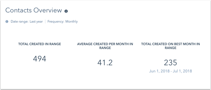
Contacts Overview
The Contacts Overview report gives you an overview of your contact database in the selected date range. View the total number of contacts created within the date range, as well as the average created per day/week/month in the range and the total created on the day/week/month in the range with the highest number of created contacts based on the frequency selected for the report.
New Contacts By Source
The New Contacts By Source report shows the number of new contacts created within the selected date range broken down by the Original Source property.
 Most Recently Created Contacts
The Most Recently Created Contacts report shows a list of your contacts sorted by create date. Use the navigation at the bottom of the report to see more of your recently created contacts.
 Returning Contacts
The Returning Contacts report shows a list of your contacts sorted by the Number of sessions property, which allows you to see which of your contacts have returned to your website the most. Use the navigation at the bottom of the report to see more contacts.

Marketing Hub Professional, and Enterprise only
Marketing Performance
The Marketing Performance report shows the total number of sessions on your website, how many contacts were generated, and how many customers were generated within the specified date range (this month to date by default). Use conversion rates to identify where your biggest bottlenecks are and how they're changing over time.
Please note: customers appear in the month of first conversion, not the month that they became a customer. Because the customer count for previous months can continue to change as leads convert, the Customers section of this widget does not compare to previous timeframes.
Here are the components of the Marketing Performance report:
- Sessions: the number of times visitors have reached your site from an external source during the selected timeframe. Learn more about sessions here.
- Conversion rate of sessions-to-contacts
- Contacts: the number of new contacts generated during the selected timeframe. Contacts will only be reflected if they were created as a contact and visited your site within the select timeframe.
- Conversion rate of contacts-to-customers
- Customers: the number of customers who were created during the selected timeframe. For example, if a contact was originally created in May and became a customer during the month of July, this contact would be included in the count of customers for the month of May.
- Comparison line of the selected timeframe to the previous timeframe (please note that the customers graph does not compare to previous timeframes).
- Goal line: if you've set goals, the goal line will display your performance in the selected timeframe relative to your goals. Learn more about setting goals.

To include offline sources in your data, select the Include offline sources checkbox. If you're seeing different numbers than other users, check to see if this is selected as this is set on a per-user basis.
You can also select the Show goal line checkbox to compare your current marketing performance data to your marketing goals.
Landing Page Performance
The Landing Page Performance report shows the views, submissions, views to submissions rate, and number of new contacts generated by your HubSpot landing pages in the specified date range. These totals also include contacts generated by HubSpot website pages.
You can also see if your landing page performance has improved or not by looking at the comparison percentages below each number. A green arrow indicates an increase; red indicates a decrease.
Please note: landing page data will only appear on your dashboard if there is at least one view or submission on the page within the date range you've selected.

Top Landing Pages
The Top Landing Pages report displays your top five landing pages by views and shows the views to submissions rate for each of those pages. This allows you to analyze the landing pages that are resulting in the most conversions.
Blogging Performance
The Blogging Performance report shows the overall number of blog views, the number of AMP views, the bounce rate, and the number of subscribers for your blogs.
You can also see if your blog performance has improved or not by looking at the comparison percentages below each number. A green arrow indicates an increase; red indicates a decrease.

Top Blog Posts
The Top Blog Posts report displays the top five blog posts by view within the date range selected. This allows you to analyze the type of content that is generating the most views.

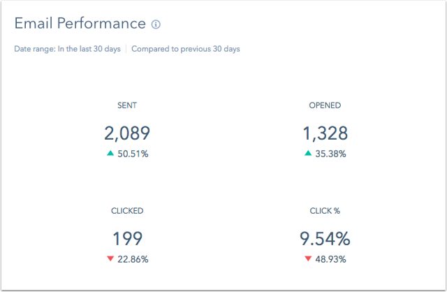
Email Performance
The Email Performance report shows the number of emails that have been sent, the number of opened emails, the number of emails in which at least one link has been clicked, and the overall click rate for the date range selected. Click rate is defined by the number of clicked emails divided by the number of sent emails.
You can also see if your email performance has improved or not by looking at the comparison percentages below each number. A green arrow indicates an increase; red indicates a decrease.
Please note: these email statistics do not include automated emails.
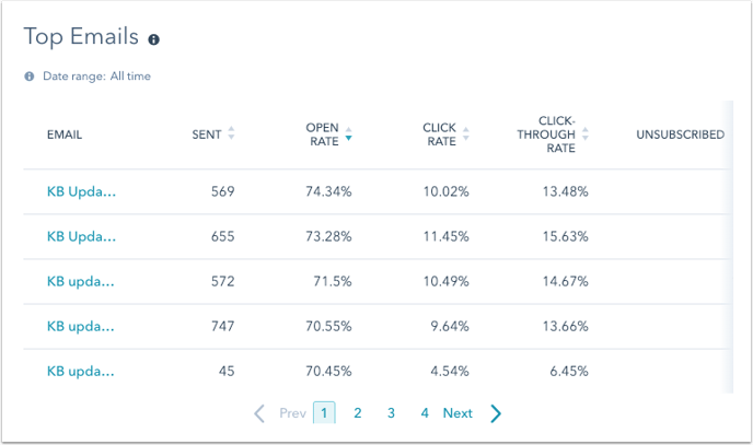
Top Emails
By default, the Top Emails report shows your five top-performing emails based on open rate within the given date range. Click the arrows to the right of a column header to sort by a different metric. This allows you to analyze your top-performing emails to determine what content and/or offers your contacts are most interested in.
Contact Performance
The Contact Performance report shows the number of new contacts, leads, marketing qualified leads, and customers in the date range selected. Other lifecycle stages (Subscriber, Sales Qualified Leads, Evangelists, Other) do not appear here.
Please note: contacts will appear in the lifecycle stage numbers for the date range in which they first converted (e.g., if a contact was created last year and became a customer this year, they would be accounted for in the customer number for last year).
You can also see how your contact numbers have changed over time by looking at the comparison percentages below each number. A green arrow indicates an increase; red indicates a decrease.

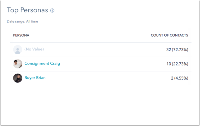
Top Personas
The Top Personas report breaks down the contacts created within the selected date range by persona. You can see which personas your contacts have been assigned to or self-identified with to better understand who is engaging with your content. Learn how to create personas.